「青」の歴史は深かったです。(愛知県名古屋市千種区姫池通 骨董買取 古美術風光舎)
2022.06.02
みなさまこんにちは、スタッフYでございます。
本日もここ名古屋はぬけるような青空。そして、暑さまでもが厳しくなってまいりました。
ところで、お気づきになった方いらっしゃいますでしょうか…
先月から古美術風光舎の朝日新聞紙面広告が、なんと夏バージョンに衣替えいたしました!。
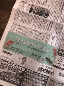
夏の紙面は、薄い青の涼しげな水面に金魚がゆらゆらと泳いでおります。
紙面にて、はっと目に留まる鮮やかなそして涼しげな青に金魚、お見掛けしました際には、しばし癒されましたら幸いでございます。
ところでそんな癒されカラー青ですが、面白い結果が出ておりましたよ。
先日とあるリサーチにて「あなたの一番好きな色は?」というアンケート。
なんと、「青」が圧倒的に人気が高いという結果に。青が第1位でして39.6%、2位以下との差が大きくダントツという結果に。次に「緑」2位16.4%と「赤」3位15.5%でして、ここはほぼ同率で続いております。4位の紫は9.1%と、こんなにもスコアに差があるという結果だそうです。
いやいや、そうはいっても年齢差や性別の差があるでしょう?思いがちですよね。ところが、男女いずれの年代層でも「青」が第1位でして、第2位と第3位については、男女年代層によって「赤」か「緑」かに分かれはしましたが、男女とも若い人は「赤」で、年配層は「緑」の人気が高いようです。
また、女性の若年層(30代以下)では他の層と少し傾向が違っており、第3位に「紫」が入りましたが、どの世代性別においてもみんな青が好きという結果になっております。
確かに私たちを取り巻くものにも、かなり「青」が存在しますが、決定的ものですと空を見上げたら青い空、青い海、青い地球でしょうか。こうなると、「青が好き」は、もう私たちの生まれる前からくみこまれたDNAの中に存在するのではないかとも思えてなりませんが。
そういえば、ブログにて以前フェルメールブルーについて綴っておりましたが、今となっては「青」は、憧れの色であり、こんなにも私たちに寄り添っているというのに、西洋では評価されない色だった歴史があるようですね。
その昔、大帝国を築いたローマ帝国にとって、青は労働階級の色、蛮族の色であったようでして、ローマ帝国の民は基本的にラテン人という民族ですが、それに対し青は異民族であるケルト人とゲルマン人の色であったようです。それゆえ、労働階級の色のイメージになったのでしょうか。
また、青は現在の黒のイメージと同様に、死と地獄と結びつけられることが多い色でした。 ですが、青がゲルマン人の色であるならば、ローマ帝国衰退後帝国に置き換わったゲルマン人の諸国家が青を好んでもおかしくないのですが、中世期(ローマ帝国衰退後)の長い間、青い服を着るのは喪のしるしだったようですので、色のイメージとはそう簡単には変わらなようですね。
そして何より、西洋で取れる青の染料はではあまり発色が良くないようでした。インド原産のインド藍(のちに西洋でインディゴと呼ばれる)も、ペルシア人商人によってローマ帝国時代にすでにもたらされていたようでしたが、海を渡ってきたため価格が高かったのと、染料ではなく鉱物と信じ込まれていたことで、染料として使われることはなかったようです。
ところがですね、ここにきて「青」に転換期が訪れます。絵画に描かれる聖母マリアの服に、青が使われるように。
聖母マリア、讃える呼び名として「Maris Stella マリス・ステラ(海の星)」が古くから用いられておりまして、その聖母マリアを表す「海の星」からくる海の青いイメージを宗教画・絵画のアトリビュートとして関連付けられ描かれたのが青い衣。有名な絵画ですとレオナルド・ダ・ヴィンチ《受胎告知》などですが、確かに宗教画の聖母マリアのイメージは青い衣ですよね。
そして、その際に使用した顔料として使用されたものが、アフガニスタンから輸入されたのがあのラピスラズリであります。当時はラピスラズリが金よりも価値をもっていたため、そのような高価なものを絵画に使用することで、聖母マリアへの賛美の意味を込めたのでしょうね。確かに、衣の青が神々しく映える印象なのは、その情報がちらつくからなのでしょうか…
そして現在、青には癒し、安らぎ、平和、友好などのイメージを多くの人は、西洋で最も人気の色のようです。
ただただ「青は大好き!」と、私も口走っおりましたが、実は「青」そのものの歴史は深いものだったとは。
青い水面と金魚を眺めながら、青の辿ってきた歴史にも触れていただけたらと思っております。
それでは、ごきげんよう。
Hello everyone, this is Staff Y.
The blue sky here in Nagoya is like today. And even in the heat, it’s getting tougher.
By the way, have you noticed …
From last month, the Asahi Shimbun advertisement of Fukosha has changed into a summer version! ..
This summer, goldfish are swimming swaying on the cool water surface of light blue. We hope that the bright and cool blue that catches your eye on the paper and the goldfish will be a healing moment for everyone.
When you see it, please take a look while being healed for a while.
By the way, it is such a healing color blue, but interesting results have been obtained.
A questionnaire in a certain research the other day, “What is your favorite color?”
As a result, “blue” is overwhelmingly popular. Blue was the first place with 39.6%, and the difference with the second place and below was large and the result was outstanding. Next, “green” was ranked 2nd at 16.4% and “red” was ranked 3rd at 15.5%, which are almost the same. Purple in 4th place is 9.1%, which is the result of such a difference in score.
No, even so, there are differences in age and gender, right? It’s easy to think. However, “blue” was the first in both men and women, and the second and third places were divided into “red” and “green” depending on the gender, but both men and women were young. Is “red”, and “green” seems to be popular among the elderly.
In addition, the tendency of young women (30s or younger) is a little different from other groups, and “purple” was ranked third, but the result was that everyone liked blue regardless of gender. We are here.
Certainly, there is a lot of “blue” in the things that surround us, but if you look up at the sky, it will be the blue sky, the blue sea, and the blue earth. When this happens, I can’t help but think that “I like blue” is already in the DNA that was ingested before we were born.
By the way, I used to write about Vermeer Blue on my blog, but now “blue” is a color I admire, and even though it is so close to us, it is not appreciated in the West. It seems that it has a long history.
A long time ago, for the Roman Empire, which built the Great Empire, blue seemed to be the color of the labor class, the color of the barbarians, and the people of the Roman Empire were basically Latin people, whereas blue was a different ethnic group. It seems that it was the color of a certain Celtic and Germanic people. Therefore, did it become an image of the color of the working class?
Also, blue was a color often associated with death and hell, similar to the current image of black. However, if blue is the color of the Germanic people, it is not surprising that the Germanic nations who replaced the empire after the decline of the Roman Empire preferred blue, but for a long time in the Middle Ages (after the decline of the Roman Empire), it was blue. It seems that wearing clothes was a sign of mourning, so it seems that it is not so easy to change from the image of color.
And above all, the blue dyes that can be taken in the West did not seem to develop very well. Indian indigo (later called indigo in the West), native to India, also seemed to have already been brought by Persian merchants during the Roman Empire, but it was expensive because it crossed the sea, and minerals rather than dyes. It seems that it was never used as a dye because it was believed to be.
However, the turning point will come to “blue” here. Blue is used in the clothes of the Virgin Mary in the paintings.
“Maris Stella” has been used for a long time as a praise for the Virgin Mary, and the blue image of the sea from the “Our Lady” representing the Virgin Mary is an attribute of religious paintings and paintings. The blue robe was associated and drawn as. Famous paintings include Leonardo da Vinci’s Annunciation, but the image of the Virgin Mary in religious paintings is certainly a blue robe.
The pigment used at that time was lapis lazuli, which was imported from Afghanistan. At that time, lapis lazuli was more valuable than gold, so using such an expensive item in the painting would have meant a praise to the Virgin Mary. Certainly, the reason why the blue of the clothes looks divine is because the information flickers …
And now, many people have the image of healing, peace, peace, friendship, etc. in blue, which seems to be the most popular color in the West.
I just said, “I love blue!”, But in reality, “blue” itself has a deep history.
We hope that you will be able to experience the history of blue while gazing at the blue water surface and goldfish.
Well then, good luck.
*********************
爽やかなお天気が続いておりますね。お片付けなどされてる方もおおいのではないでしょうか。
風光舎では、古美術品や骨董品の他にも絵画や宝石、趣味のお品など様々なジャンルのものを買受しております。
お片付けをされていて、こういうものでもいいのかしらと迷われているものでも、どうぞお気軽にご相談下さいませ。
また風光舎は、出張買取も強化しております。
ご近所はもちろん、愛知県内、岐阜県、三重県その他の県へも出張いたします。
まずは、お電話お待ちしております。
愛知県名古屋市千種区・骨董 買取
『古美術 風光舎 名古屋店』
TEL052(734)8444
10:00-17:00 OPEN
